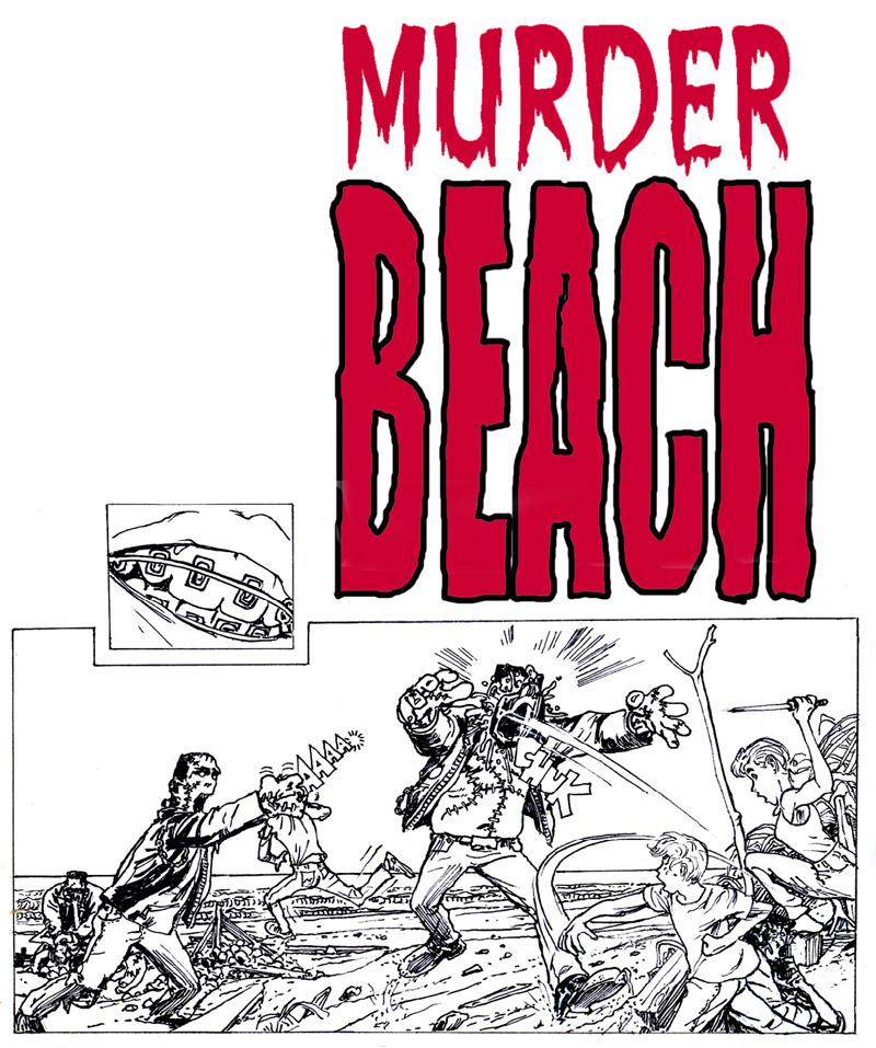
James' spec drawing for Macon Blair's Murder Beach script
STERANKO: Liked your Murder Beach cover, with the exception of the confusion generated by the stick/branch on the right. Because of it's prominent position and directional force, it seems to relate more to the monster than the kids. Actually it appears that the monster is reaching for the stick, creating a perplexing anomaly. It may also have been compositionally appropriate to overlap the nearest monster over the foot of the victim, to create the aspect of deep space. As it is, there's some confusion about that foot almost kicking the monster in the foreground (I call this a Neal Adams effect because he does it constantly). I'm surprised because there are many correct compositional decisions here (the horizon line bisecting the furthest monster's head, etc.). The foreground would be stronger and pull away from the background if you had added heavier blacks in it, rather than giving it the same tonal weight as most of the elements behind it. The foliage would have accepted it very well. DANGER ALERT: The girl in the lower right corner is VERY difficult to read; she's almost lost in the multitude of shapes in the area. And what has the hero hurled into the monster's face? A 10-pound ham? I pondered this for a while with no solution. The title is handled in cliche manner. Deliberate or accident?